|
For my assignment in Illustrator, I chose a random font called the Broadway font. The Broadway font was created by Morris Fuller Benton; the traditional name was LTC Broadway; and the year was 1927. My assignment was to learn the history of the font, make a poster, and write the uppercase and lowercase alphabets. And numbers, and type it in Broadway font. And along with typing the history of the font, And the hardest part of the assignment was finding the history of the font. I love history, but finding this one was really hard. The easy part was typing the font in numbers and letters. I am looking forward to typing more fonts, like Broadway, and starting my projects and assignments in Illustrator. From Isha Chintaram.3/1/2024 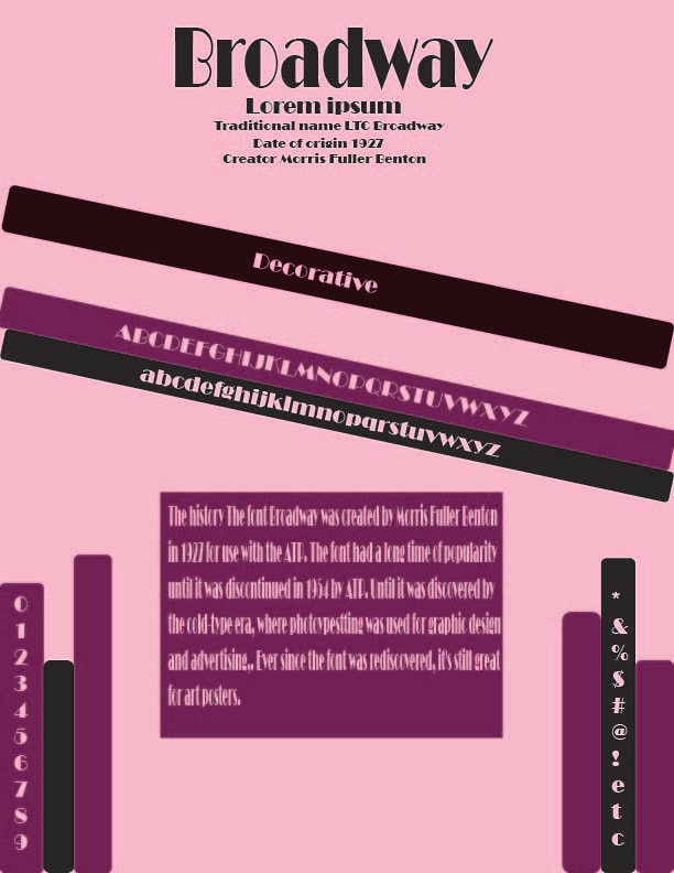
0 Comments
For my new assignment, we started an app in Adobe called Illustrator where you can create vector graphics. Illustrator and Photoshop are a little similar, but they are different. Photoshop uses pixels, and Illustrator doesn't. For this assignment, I create a pizza, so the tools I use are selection tools, direction tools, fill strokes, shape tools, and transform. The sections were to select an object or one direction, and one was to select an individual object. The fill is filling the color inside the shape; the stroke is the color outlines the shapes create. The shape tool is very similar to Photoshop, where it allows you to create basic shapes, and the transform tool is a little bit similar to the tools for 3DMax, where you can rotate the objects in any direction you choose. I like Illustrator to use it in the future for things like posters or letters. What I like about Illustrator tools is that the transforms tool was so easy to use and move in the right directions where I wanted to. What I dislike is the right size and color for my pizza. I can't wait to start with Illustrator assignments or projects like this. 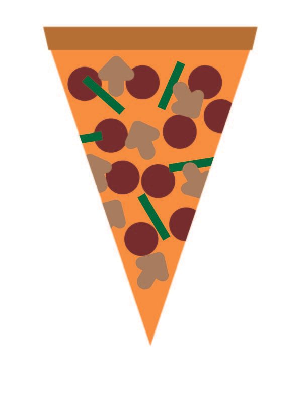 Here is what I learned in the material editor in 3D Max. So I started opening the material editor. And use render scanline, then I choose a cylinder and diffuse color. And the specular color and highlights. I chose purple for my cylinder and aqua blue for my lighter. For my Owl Box, I started to find a photo I liked, so I thought, Why not a snow owl? So I put it in Photoshop and edited it with a black and white adjustment layer and another layer with color. Then I bump it and put it into Bitmaps. I put one color in diffuse and the other in bump; after that, I rendered and bumped it just right, and it came out right. The last one was multi/sub-object, where I start with a box and add two faces on each side of the box. Then I go to material edit and add multi/sub-object and get 4 standard (legacy). I choose different colors for each of them, and I go to edit poly and change the color faces on each side. And that's my project, and I'm looking forward to more projects. |
AuthorThe views and opinions expressed in this blog are solely those of the author and do not represent those of Chapel Hill HS or Chapel Hill-Carrboro City Schools Archives
March 2024
Categories |
 RSS Feed
