|
For this assignment, I did the 180-rule video clips. The 180 clips are called the short/reveres short film, where you do shots of two different scenes where they interact with one another. For the assignment, I have to use the 180 rule and have a two-person conversation about a knock-knock joke. So I did short clips and put them in my order in exactly 30 seconds of the entire joke scene,along with different cuts and transitions of the scene. And for the ending, I put the end credits of the person and background music; that was the easy part. The hardest part was doing the cut, and the transition was tough. I thought this project was fun and cool to learn how to do cuts and transitions. I am looking forward to assignments with Premire Pro on how to do more video editing.
From Isha Chintaram
0 Comments
For my assignment, I used fluid momentum. So for my assignment, I had to do different clips of that same person and create a short story for it. And royalty music in the background. Along with that, round up to 20 seconds. For my experience of using video clips rather than basic images, I like the images easier because there is no movement and they are just images to make it easier. But video clips are harder for a reason: timing it right and all movement is not standing still. It was very different between working with video clips and images. The hardest part was timing the clips just right with the music for about 20 seconds. The easy part was, the choosing the music for the background of my video clip. This was a challenging assignment, but I can't wait to see these assignments.
From Isha Chintaram
For my assignment, I had to create a short theme film that I chose. By finding short clips in the royalty-free clips. For my theme, I decided on Night at the Stars because the stars are always so fascinating to me and so beautiful. So my shorts were camping, night gazing, and in nature. The difference between images and short clips was cutting and timing the footage of the clips exactly right,which was the hardest part of creating the video. The image was of the same object, and it's not going to move. The easy part was choosing the theme of the video clip. For my thoughts on this assignment, I want this theme, Night of the Stars, along with calming music and stargazing scene music. I am looking forward to more new assignments in Premire Pro for editing and creating video clips.
From Isha Chintaram
For my new assignment, I was to make an intro video with the color of your choice. I chose purple as one of my favorite colors. I have to find purple images and put them in a video at exactly 15 seconds. The hardest part was finding the perfect purple images of any kind, downloading them in the right sizes, and putting them in Premiere Pro. The easy part was putting the images in order and cutting some of them to put them all together in exactly 15 seconds. My thoughts of putting my video editing together were confusing at the beginning, but in the end, I got the hang of it. I hope I can do my video editing assignments on Premiere Pro and improve my skills as well.
From Isha Chintaram For my assignment, its to trace the logos of Star Wars and add color. For my assignment, the easy part was choosing the colors and improving my pen tool skills. The hard part was tracing the pen sizes, which had to be just right for the logos. I can't wait to do more of my assignments with the pen tool and trace them. From Isha Chintaram Today I learned about my new assignment for designing digital badges, each with their own design. The first one was creating the shapes and colors for each badge. The first one is the sunset one, which I love because of the purple, red, organic, and yellow colors its perfect. The second one was the gem badge. I love shining stones, and gems would fit perfectly for the level. And the final one is the shine star badge, telling the final 3rd level you reach the star, the sky is limited, so I put the star a gradient purple effect tool along with the other badges. The tools I used for the assignment are directions ,selections line, segmentation, shape, and rotation tools. The easy part of my project is to improve my selection of shape tools and colors. The hardest part was choosing a unique design for each particular badge. I can't wait for more projects in Illustrator. From Isha Chintaram 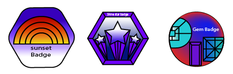 For my assignment in Illustrator, I chose a random font called the Broadway font. The Broadway font was created by Morris Fuller Benton; the traditional name was LTC Broadway; and the year was 1927. My assignment was to learn the history of the font, make a poster, and write the uppercase and lowercase alphabets. And numbers, and type it in Broadway font. And along with typing the history of the font, And the hardest part of the assignment was finding the history of the font. I love history, but finding this one was really hard. The easy part was typing the font in numbers and letters. I am looking forward to typing more fonts, like Broadway, and starting my projects and assignments in Illustrator. From Isha Chintaram.3/1/2024 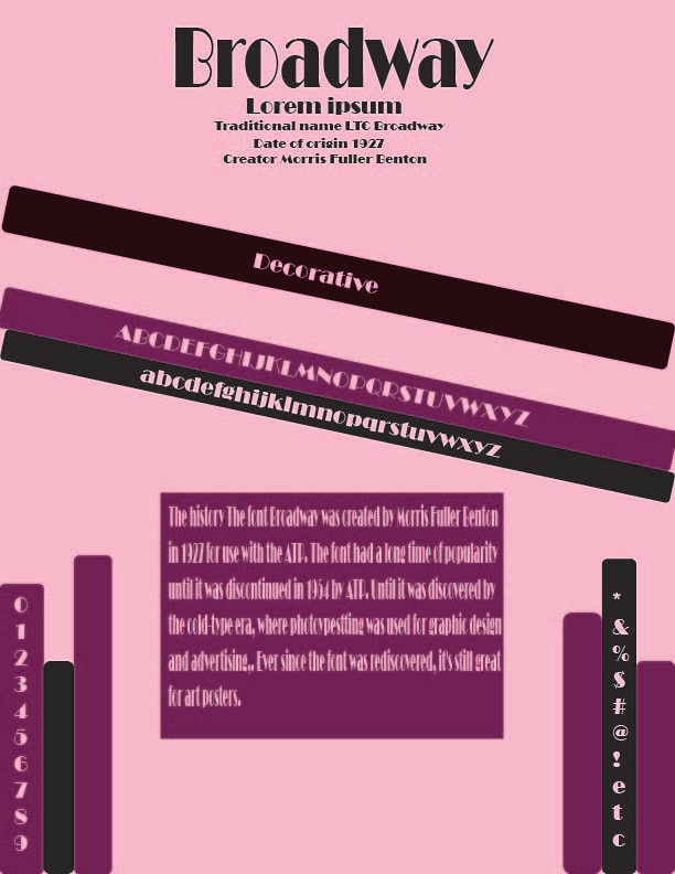 For my new assignment, we started an app in Adobe called Illustrator where you can create vector graphics. Illustrator and Photoshop are a little similar, but they are different. Photoshop uses pixels, and Illustrator doesn't. For this assignment, I create a pizza, so the tools I use are selection tools, direction tools, fill strokes, shape tools, and transform. The sections were to select an object or one direction, and one was to select an individual object. The fill is filling the color inside the shape; the stroke is the color outlines the shapes create. The shape tool is very similar to Photoshop, where it allows you to create basic shapes, and the transform tool is a little bit similar to the tools for 3DMax, where you can rotate the objects in any direction you choose. I like Illustrator to use it in the future for things like posters or letters. What I like about Illustrator tools is that the transforms tool was so easy to use and move in the right directions where I wanted to. What I dislike is the right size and color for my pizza. I can't wait to start with Illustrator assignments or projects like this. 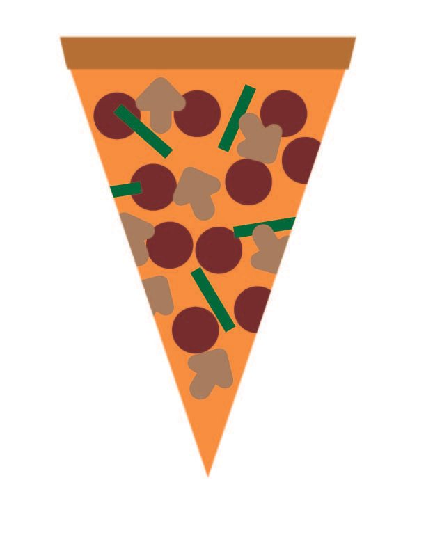 Here is what I learned in the material editor in 3D Max. So I started opening the material editor. And use render scanline, then I choose a cylinder and diffuse color. And the specular color and highlights. I chose purple for my cylinder and aqua blue for my lighter. For my Owl Box, I started to find a photo I liked, so I thought, Why not a snow owl? So I put it in Photoshop and edited it with a black and white adjustment layer and another layer with color. Then I bump it and put it into Bitmaps. I put one color in diffuse and the other in bump; after that, I rendered and bumped it just right, and it came out right. The last one was multi/sub-object, where I start with a box and add two faces on each side of the box. Then I go to material edit and add multi/sub-object and get 4 standard (legacy). I choose different colors for each of them, and I go to edit poly and change the color faces on each side. And that's my project, and I'm looking forward to more projects. |
AuthorThe views and opinions expressed in this blog are solely those of the author and do not represent those of Chapel Hill HS or Chapel Hill-Carrboro City Schools Archives
March 2024
Categories |
 RSS Feed
